Visualization is frequenctly used to show scientific ideas or experimental results, but it is difficult for
us to master. There are many styles for different individuals for they favor different colors, markers, and line styles.
Color choice is very important to visualize data among above terms. Here we give some colors for making clear our ideas.
1. Empirical probability image
We usually use hit counts to compute empirical probability from large datasets, for example, the power spectral density
curve of ambient seismic noise. First we generate a synthetic curve, and add noise to this synthetic curve for counting
hits on this curve. Finally, we normalize these hit counts along the horizontal axis to obtain the empirical probability
images.
Import required packages.
1
2
3
|
import numpy as np
import matplotlib.pyplot as plt
import matplotlib as mpl
|
2. How to make your favorite colormaps using the matplotlib package
First set a list containing colors, and these colors may be simple ‘r’, ‘g’, ‘b’ …
or hexadecimal RGB colors. Then we can use matplotlib.colors.LinearSegmentedColormap.from_list to
make our colormaps. The following example may help you.
1
2
3
|
col = ['w', 'r', 'k']
# or col = ['#FFFFFF', 'FF0000', '#00000']
cmap = mpl.colors.LinearSegmentedColormap.from_list('cmap', col, 201)
|
The variable camp can be used to visualize our data in methods like plt.pcolormesh()
or plt.contourf().
3. Some useful colormaps
Generate a synthetic curve and count hits on this curve.
 1
 2
 3
 4
 5
 6
 7
 8
 9
10
11
12
13
14
15
16
17
|
n = 201
dx = 5e-2
x = np.arange(n) * dx
sl = n // 20
s0 = np.sin(x) + np.random.randn(n) * 1.5
s0 = np.convolve(s0, np.ones(sl)/sl, 'same')
m = 101
y = np.linspace(-4, 4, m)
pdf = np.zeros((m, n))
k = 1001
for i in range(k):
    ss = s0 + np.random.randn() * 0.5
    for j in range(n):
        si = np.argmin(np.abs(ss[j]-y))
        pdf[si, j] += 1
for i in range(pdf.shape[1]):
    pdf[:, i] /= np.sum(pdf[:, i])
|
Here we set some colors to make colormaps for visualizing the empirical probability image.
 1
 2
 3
 4
 5
 6
 7
 8
 9
10
11
12
13
14
15
16
17
18
19
20
21
22
23
24
25
26
27
28
29
30
31
32
33
34
35
36
37
38
39
|
c01 = '#FFFFFF #92D1F3 #5AB592 #EEAC4C #DC4244 #81151D'
c02 = '#FFFFFF #FDFDFD #ECF6FE #D6E2FE #B5C9FB #8FB1FF #7F96FE #6271F8 #467B4B #3BBC3E #B3D16E  #B9FA6C #FEFA14 #FFA108 #E70001 #820001 #3F0706'
c03 = '#FFFFFF #FBFDFF #EEF7FF #EEF7FF #9DCDFF #C3E095 #F1F821 #FFC000 #FF6900 #C72E00 #9E0500'
c04 = '#FFFFFF #FAFCFB #F1FFFF #BAFEFF #84FEFF #08FFCA #08FF00 #8FFE01 #FFDE00 #FFDE00 #FFDE00 #FE3000 #FE3000'
c05 = '#FFFFFF #FCFDBA #FEFC7C #FEF80d #FFD007 #FE8C02 #FE3F09 #D40003 #7C0102 #160104'
c06 = '#FFFFFF #EDF3F3 #3E9C43 #3E9C43 #FCFE00 #FF6B00 #FF3300 #A01430'
c07 = '#FBFDFE #ECF6F9 #DDEFF5 #CFE8F0 #C0E1EC #B0D9E7 #B9DEC5 #C8E59B #D7EC6F #E6F345 #F5FA1B #FFEE00 #FFBF00 #FF9100 #FF6100 #FF3300'
c08 = '#FFFFFF #FBFBFB #F5F2FF #D9D1F9 #B4B9FA #9C9BF5 #7EA1D6 #5CA1A7 #35A96C #63C100 #C9D600 #FFDB00 #FF7D00 #F13E00 #F00000 #81151D'
c09 = '#FFFFFF #FEFEFE #ECECEC #A3D6EF #76C9F4 #4FC0E7 #66CFB0 #7CDB85 #FCDA44 #FBBC3B #FA5C54 #DF1D28 #81151D'
c10 = '#FFFFFF #FDFDFD #CACACC #A9A9CC #8080CC #5855CA #85449B #D33959 #FF432F #FF8020 #FFBA11 #FFD909'
c11 = '#FFFFFF #F5F5FF #D7D7FF #A4A4FF #5C5CFF #3030FF #002EBD #007B5C #2DC105 #A3E401 #EBF900 #FFD700 #FF7100 #FF4500 #FF0000'
c12 = '#FFFFFF #F2FAFE #E0F3FD #C1E7FB #7EBEE7 #5BA0D4 #47A097 #71BF4B #D9DF57 #F8B345 #E74B2A #C12027 #9A2425'
c13 = '#FFFFFF #FDFDFD #E3FFFE #AFF9FA #78DDE0 #6099E9 #2A52F4 #0106F0 #112572'
c14 = '#FFFFFF #FEFEFE #FDFDFD #FBFEA7 #FF712F #FC4C20 #F50806 #B5070a #830e0e #4C1210'
c15 = '#FFFFFF #FEFEFE #FFFEFD #FFE6FD #FCC6FF #FD83FC #FF3AFE #F20bFF #8200FF #4D00FF'
c16 = '#FFFFFF #FEFEFE #F9EDDA #EFDACF #DFBDBF #CC99AE #B387B8 #7C6BB9 #4B53B2 #3943A4 #3943A4'
c17 = '#FFFFFF #ECEDED #93FF4A #D9F105 #FF6900 #FD0100 #971127 #550000'
c18 = '#FFFFFF #FEFEFE #F0F0F0 #E0E0E0 #A0A0A0 #777777 #444444 #222222 #111111 #000000'
c19 = '#FFFFFF #EFFCFF #B5F0FE #76E3FE #01ADF9 #0074E6 #001ED0 #4900C8 #A500BD #9F00AA'
c20 = '#FFFFFF #FEFEFE #F8F3F4 #CECCE3 #94B2D4 #2E89AD #0f7872 #065C4A #014833 #17155F'
c21 = '#FFFFFF #F2F8F3 #CCECFA #8FC0F5 #478CF3 #0173FA #83B0B9 #AEC790 #D6DC64 #EDF515 #FAD403 #FB9F01 #F75317 #F91106 #B8457E'
c22 = '#FFFFFF #FFFFD3 #FEFF99 #FEE67F #FFB24E #E64E05 #9E0412 #36045B #000aA9 #1533FB #0f87F8 #09FAE9'
c23 = '#FFFFFF #FDFDFD #F3F8FF #98D4FB #62AFF8 #3998F5 #8EBCEA #F390C9 #E6007F #C53594 #85008A #3C0092'
c24 = '#FFFFFF #FEFEFE #F9FAFF #E4EAFF #C6D1F7 #DED398 #FFF131 #FFD644 #FFB950 #FF6062 #FF006B #FF002B #B11028 #81151D'

c = [c01, c02, c03, c04, c05, c06, c07, c08, c09, c10, c11, c12, c13, c14, c15, c16, c17, c18, c19, c20, c21, c22, c23, c24]
nc = 4; nr = len(c) // nc
if nr * nc < len(c):
    nr += 1
fig = plt.figure(figsize=(18, 10))
fig.subplots_adjust(left=0.05, bottom=0.05, right=0.98, top=0.98)
for i in range(len(c)):
    cmap = mpl.colors.LinearSegmentedColormap.from_list('cmap', c[i].split(), 201)
    plt.subplot(nr, nc, i+1)
    plt.pcolormesh(x, y, pdf*100, cmap=cmap)
    cbar = plt.colorbar()
    cbar.ax.tick_params(labelsize=10); plt.gca().tick_params(labelsize=11)
    plt.text(4.5, 2.5, 'c%02d'%(i+1), fontdict={'size': 15})
plt.show()
|
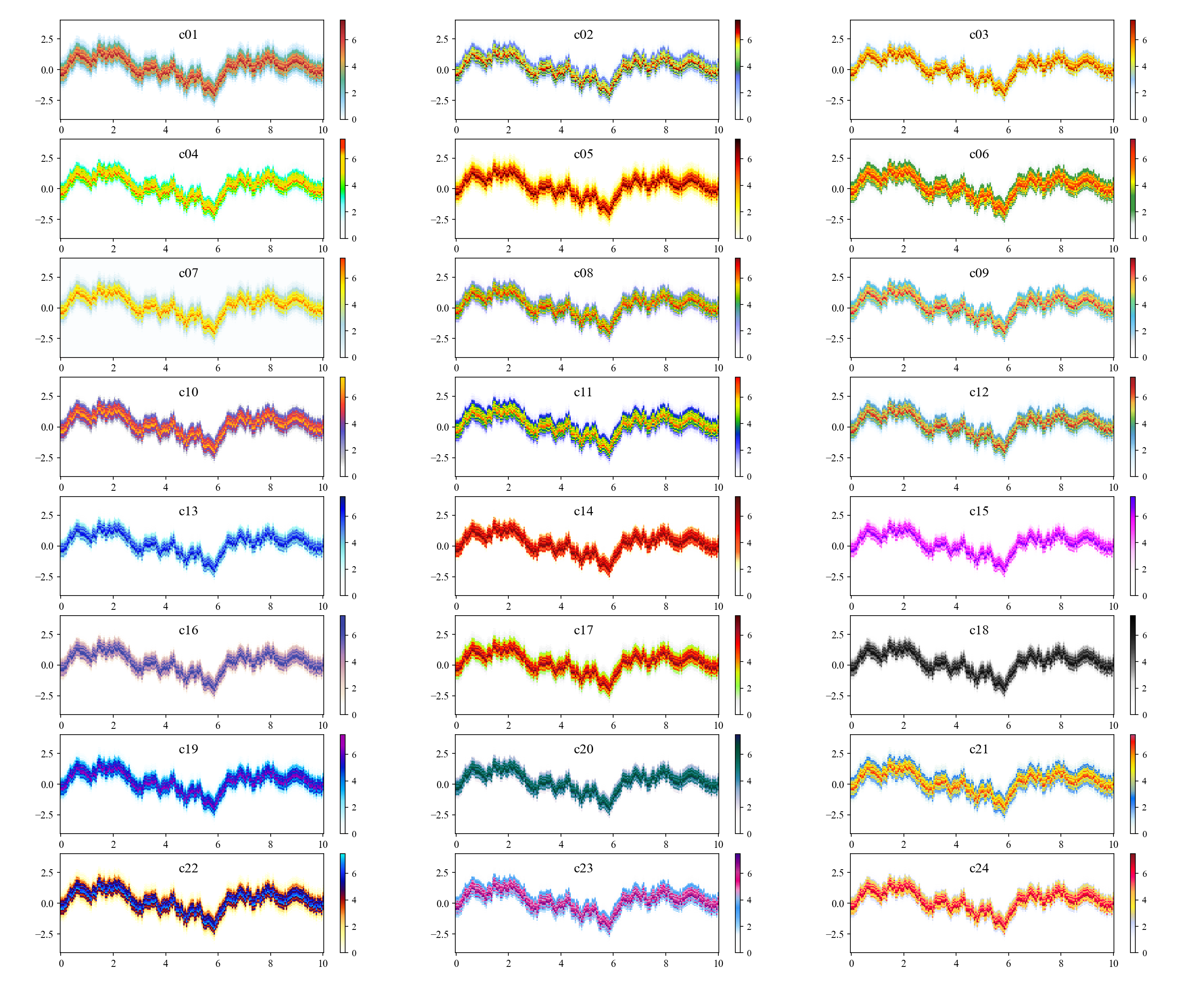
Just copy corresponding colors accoding to the order number on panels in above figure if you like.
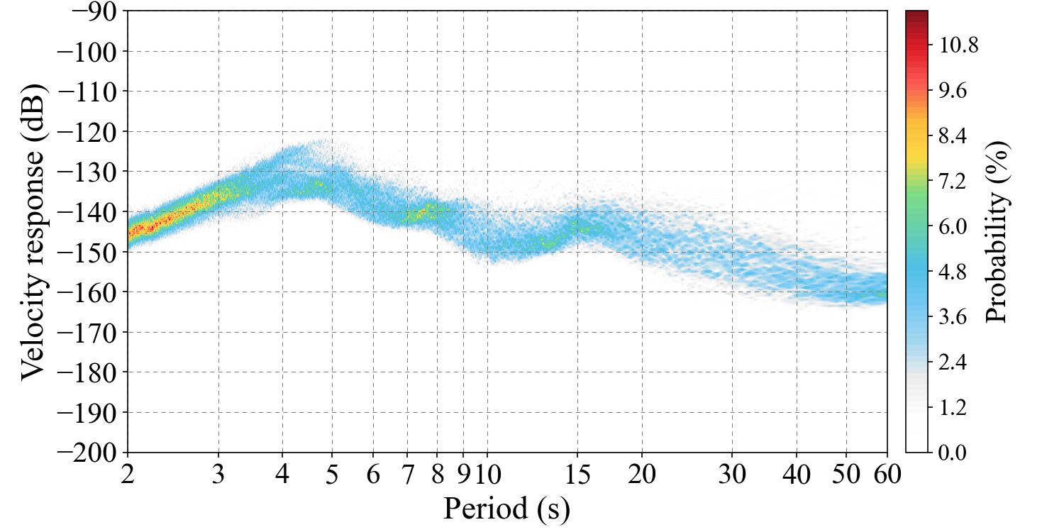
4. The power spectral density curve probability of seismic ambient noise excited by ocean waves
We collected three-year (from 2018 to 2020) vertical-component (BHZ) seismic data made by broadband station IC.ENH installed in Hubei province, China to compute the empirical
probability of power spectral density curve on the band of [2, 60] second. This image show the features of power spectral density
of seismic ambient noise generated by sea waves (two spectral peaks, about periods of 6 s and 15 s found in this figure).
Here we use colomap made from c09 color string to make colors for showing the probability image.