Settings in Python Plotting

Contents
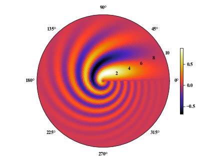
1 Pseudo-color map with polar projection
We usually need to plot pseudo-color maps in polar projection besides
except of those in Cartesian projection. Setting the projection as
polar in method subplot. Here , we give an example of python code.
Example:
|
|
2 Color bar, tick, axis, grid line and frame settings
2.1 Color bar
shrink: Relative length of color bar;
aspect: The ratio of height (length) to width;
pad: The distance between map and color bar.
|
|
Example:`
|
|
2.2 Ticks
-
fontsize: Size of tick fonts; -
rotation: Rotation angle of tick fonts;1plt.xticks(fontsize=12, rotation=-90) -
Setting tick strings:
1 2 3 4t = np.linspace(0, 10, 101) s = np.sin(s) plt.plot(t, s) plt.xticks(np.arange(1, 10, 2), ['I', 'III', 'V', 'VII', 'IX']) -
The directions of ticks:
1 2plt.rcParams['xtick.direction'] = 'in' # 'out' for outward plt.rcParams['ytick.direction'] = 'in' # 'out' for outward -
The positions of ticks:
1 2ax.xaxis.set_ticks_position('top') # Put the x ticks on the top side. ax.yaxis.set_ticks_position('right') # Put the y ticks on the right side.Example:`
1 2 3 4 5 6 7 8 9 10 11 12 13 14n = 101 x = np.linspace(0, 4*np.pi, n) y = np.sin(x) plt.figure(figsize=(6, 3)) plt.plot(x, y, lw=2, color='b') plt.xticks(np.arange(5)*np.pi, ['0', r'$\pi$', r'$2\pi$', r'$3\pi$', r'$4\pi$']) plt.rcParams['xtick.direction'] = 'in' plt.rcParams['ytick.direction'] = 'in' ax = plt.gca() ax.xaxis.set_ticks_position('top') # Put the x ticks on the top side. ax.yaxis.set_ticks_position('right') # Put the y ticks on the right side. plt.tight_layout() plt.show()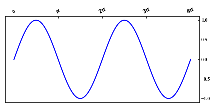
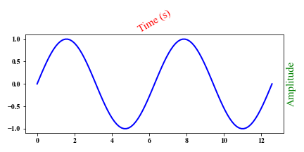
2.3 Label
color: Color of label;rotation: Rotation angle of the label;fontsize: Font size of the label.- label position
ax.yaxis.set_label_position('right')orax.xaxis.set_label_position('top')
|
|
Example:
|
|
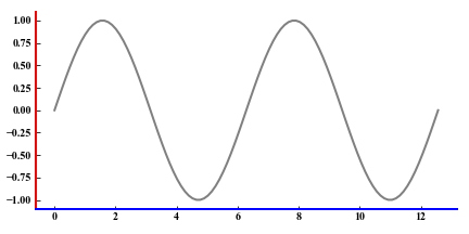
2.4 Axes
plt.gca().invert_xaxis()orplt.gca().invert_yaxis(): Invert x or y axis;- Setting frames: visible (True) or invisible (False):
|
|
-
The position of axes:ax.xaxis.set_label_position('top'): Setting'bottom'to put it on the bottom side;ax.yaxis.set_label_position('right'): Setting'left'to put it on the left side. -
The width of the frame:
1 2 3 4 5 6bwidth = 2 ax = plt.gca() ax.spines['bottom'].set_linewidth(bwidth) ax.spines['left'].set_linewidth(bwidth) ax.spines['top'].set_linewidth(bwidth) ax.spines['right'].set_linewidth(bwidth) -
The color of the frame:
1 2 3 4ax.spines['left'].set_color('r') ax.spines['top'].set_color('b') ax.spines['right'].set_color('r') ax.spines['bottom'].set_color('b')
Example:
|
|
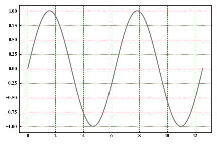
2.5 Grid lines
- Major grid lines.
|
|
- Minor grid lines.
|
|
- Setting grid lines with your style.
|
|
-
Settings of the figure frame.
1 2 3 4 5 6 7 8 9 10 11 12bwidth = 2 ax = plt.gca() # Set the width of the frame. ax.spines['bottom'].set_linewidth(bwidth) ax.spines['left'].set_linewidth(bwidth) ax.spines['top'].set_linewidth(bwidth) ax.spines['right'].set_linewidth(bwidth) # Set the frame color. ax.spines['bottom'].set_color('#666666') ax.spines['left'].set_color('#333333') ax.spines['right'].set_color('#333333') ax.spines['top'].set_color('#333333')
Example:
|
|
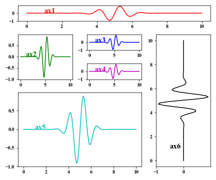
2.6 Subplot alignment
ax = plt.subplot2grid((r, c), (rp, cp), rowspan=nr, colspan=nc)
r: rows of the whole figure;
c: columns of the whole figure;
rp: the start row index of the sub-figure, and it must be lower than r;
cp: the start column index of the current sub-figure, and it must be lower than c;
nr: the row number of the current sub-figure;
nc: the column number of the current sub-figure.
|
|
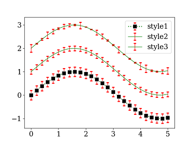
3 Background, error bars
background
|
|
Error bars
|
|
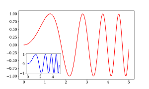
4 Inset a smaller figure
|
|
5 Remove the withe grid lines in saved PDF file
|
|
6 Make a color map with your own colors
|
|
7 Text with the $LaTeX$ style
|
|
Author Geophydog
LastMod 2020-09-18